In this article we show the ins and outs of explaining a complex software product, using the video we made for Prism Workpath as a reference. The case study shows the steps that were taken to simplify the complexity of the software and bring out its core benefits.
The Brief
The client wanted to introduce WorkPath to new potential users. WorkPath is a process automation platform and it was important to show how it automates and accelerates processes while greatly reducing costs. We needed to clearly show the different ways in which it can improve productivity.
Script
One of our seasoned writers Angela was assigned to the project. She tried to focus on the problem that Workpath was solving for its audience and make sure this was clear. It was a balancing act of highlighting its potential without overloading the viewer with features. In terms of visuals, she scripted in some isometric and 3D visuals. In the early draft, there were some animated characters in the script but these were removed during revision rounds.
Voiceover
The tone of the brand is informative and intuitive and so we did casting with that in mind. The video needed to be created using both a UK voice and a US voice for two different markets. We found two voices that worked well for the brand; Mike Hathcote for the US version and David Johnston for the UK version.
Styling
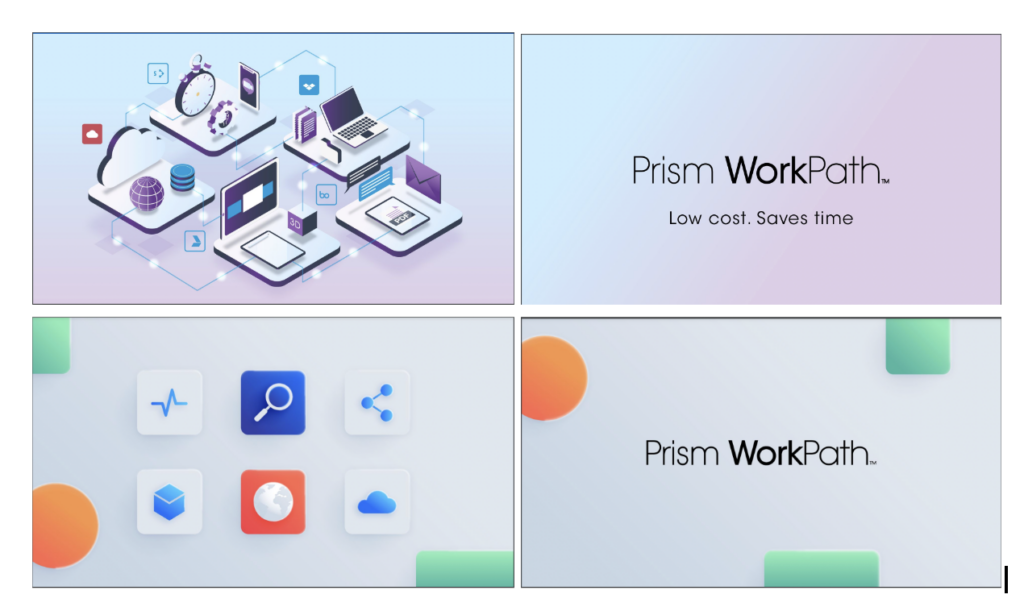
We got to work on the design and our first draft consisted of the two options below

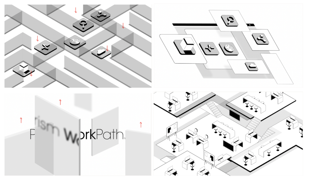
Along with the client, we decided these needed to have a more ‘soft’ futuristic feel, and we needed to double down further on the isometric/3D feel. We did some sketches and showed them to the client to ensure we were aligned with the client (see below).

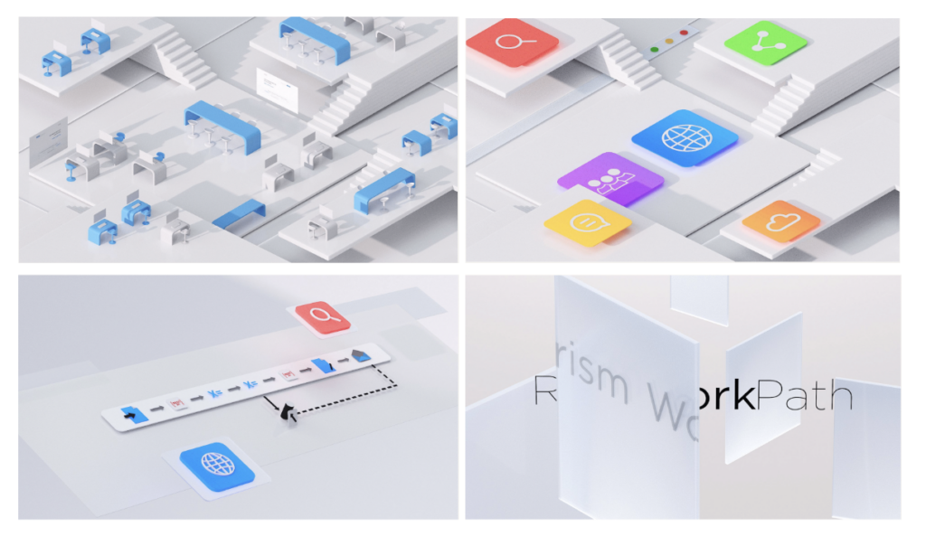
They gave us the thumbs up and we turned them into graphics:

Graphics and Sound
We moved forward to create the full set of graphics. To make the product look simple and emphasize how it streamlines processes we kept the aesthetic clean, sophisticated and minimal. We also tried to evoke this same emotion when choosing music. We selected a soundtrack already at this early stage as we wanted the music to inform the animation.
Animation
Using sleek 3D isometric animation, we focussed on making the motion soft and streamlined like the technology. The transitions specifically needed to flow and give the idea of effortlessness as we communicated how processes were being automated. For example, we did not use any hard cuts to help emphasize this. Below is the finished video. What do you think? Does it hit the key objective?
Conclusion
Making a product easy to understand is a combined production effort, requiring alignment from scripting through to storyboarding, animation and sound. Here are more examples of software explainer videos from our portfolio.
