We recently worked with Bob Whitehead, CEO of Green Arrow Labs, on an animated overview explainer video for his company. Below is a breakdown of the process and the final video.
The Brief
Ultimately, the video has to be featured front and center on the homepage of Green Arrow Labs. Firstly, Bob wanted the video to be visually striking and professional. Secondly, it definitely should not look cartoon-like. And thirdly, he liked the idea of using seamless transitions, such as in one of our sample videos. Obviously, he had high expectations and we really don’t like disappointing clients!
Production
Our producer Curtis took up the project. When asked what the best part of working on this animated overview explainer video was, he replied: “Seeing the script come to life visually, and knowing that the client was impressed with our teamwork.”

Scripting
Bob had already prepared a draft script and so we had that as a useful starting point. We worked with him to edit it so that the visuals would flow nicely between the scenes, and also bring the script length in line. After 2 rounds of edits, we were ready.

Design & Storyboarding
The script called for some tricky transitions. Green is a major part of the brand’s identity so it had featured prominently throughout the video, the fact that the video would have to integrate with the website meant that we had to limit the number of colors used in the video. We added a texture overlay from some of the assets to some of the visuals, as plain vector images on a white background would be boring to look at.

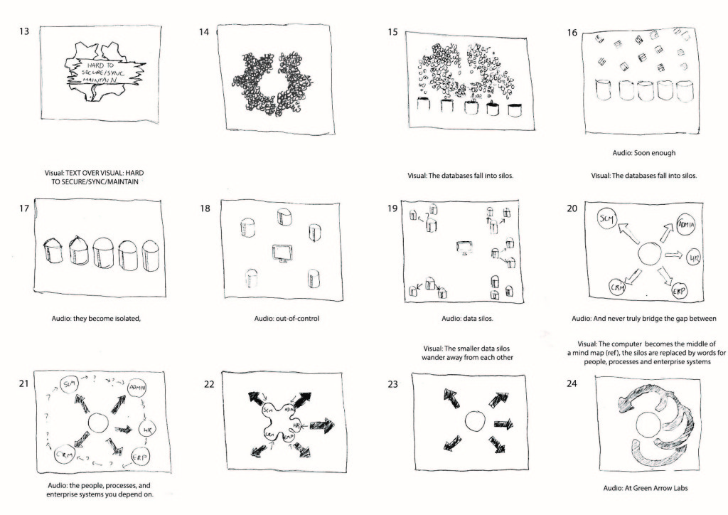
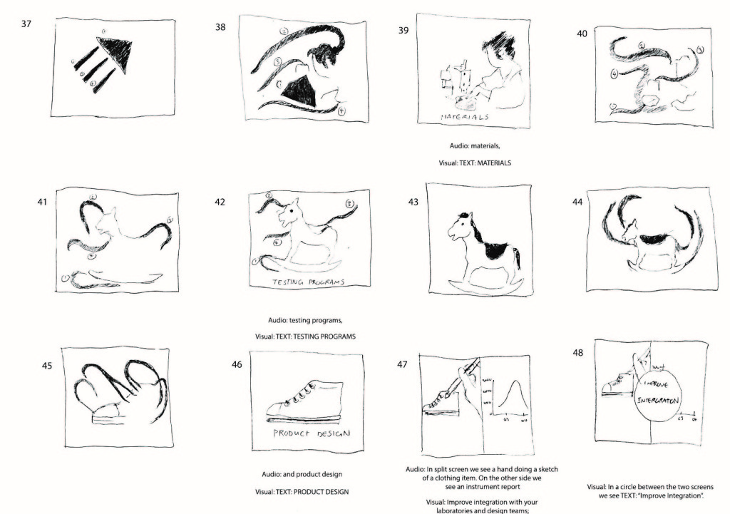
We created some style frames which were approved. After this, we made a (very!) rough, hand-drawn storyboard. Sometimes we’ll use fully-designed key frames for the storyboard, and there are pros and cons for both approaches. In this case, we were confident with the approved design and we wanted to free up more time for animation.


It was okay, generally. But Bob had a requirement that none of the visuals could touch or clip beyond the border dimensions so that it would integrate better with their website. This also meant that transitions had to be carefully planned as every object on screen would have to believably transform or morph into another. We adjusted the visuals and these were approved.
Animation
The animation process went smoothly, though quite a lot of time was invested into it. The trickiest part came when the lines that made up the factory worker had to break up and reform as a rocking horse and eventually a shoe. We were able to create a unique video that looks great, while still getting the message across. The client was pleased with the video, and so were we!
Here’s the final video:
Client Testimonial
Bob had this to say:
“I received many proposals for my video project, with pricing ranging two standard deviations from the mean. Piehole.TV was on the higher side but the professionalism of their proposal and project team stood out. Project management was top-notch — staff, communication, and tools used. Senior managers were engaged throughout. They listened and delivered a product that exceeded my admittedly high expectations. The animation is exceptional — unique, complex, artistic, engaging — exactly the look I had in mind. Great value — I won’t hesitate to use Piehole on my next video project.”
– Bob Whitehead, Green Arrow Labs’
And your Video?
Thinking about getting an explainer video for your company? Have a look at our portfolio for some inspiration. Alternatively, if you would you like to talk about your video project, simply get in touch.
